Art process

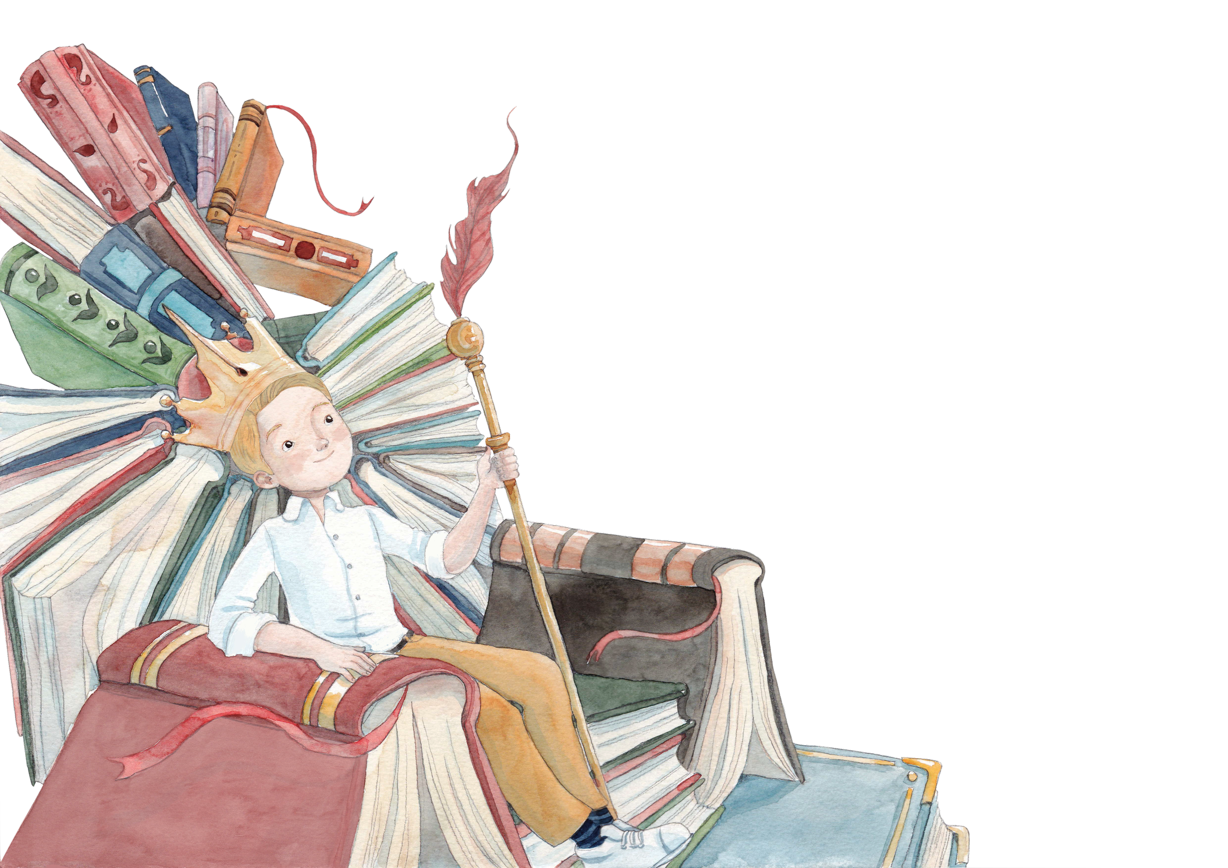
When I was writing the story I could visualise the scenes and see the story in my mind. I already knew that I wanted to have a throne made of books, a kingdom of books in a sense, where book is King and you can travel everywhere in the world with them.
The books therefore became the connecting element throughout the story and the illustrations. The other connecting element is the birds and their feathers, the quills. Traveling with a book which transforms into a bird flying in the air within a wreath of quills, therefore, naturally evolved to become the logo of the book series.
Author’s visualisation

Illustrator’s concept
“My intentions in illustrating a story is to feel the movement in every object as if you were in the middle of the story, feeling everything alive around you like the story told is the symbolic wind going through each page, illuminating its secrets. Traditional drawing makes me feel much closer to my drive to create and to feel the materials I'm drawing with. I find each brush stroke to be much more authentic than a digital one, and I value this feeling of uniqueness and elegance that it brings.”
It all begins with developing the storyboard
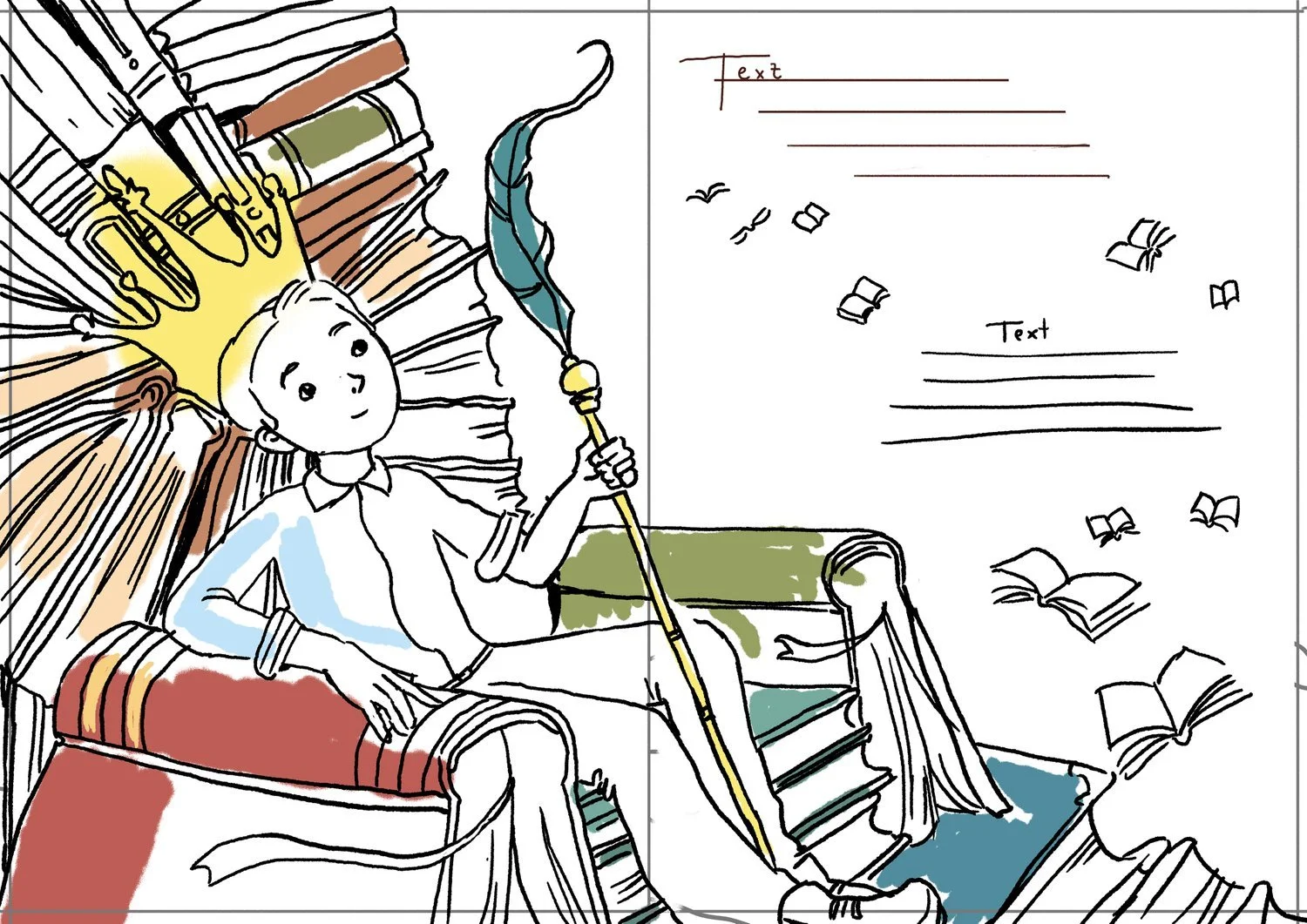
When I started working with Mateya she let me into her world of illustrations, and it is truly an entire world. She doesn’t happen to start sketching and painting, she takes the time to diligently create a storyboard, make pre-sketches of each scene, and see the storyline. We looked at the close-ups and distant views to have a combination of both. We delineated how the characters would be involved in the scenes. Each and every scene has a very specific role in the storyline, and at the same time a presence of its own.
Throughout the development of the illustrations, she further adds magical elements that connect from one scene to the other, such as the feathers or the birds, saying “I see how endless the worlds of children's imagination could be, hidden between the spreads of a book”.
Then we start by pencil sketching the scenes
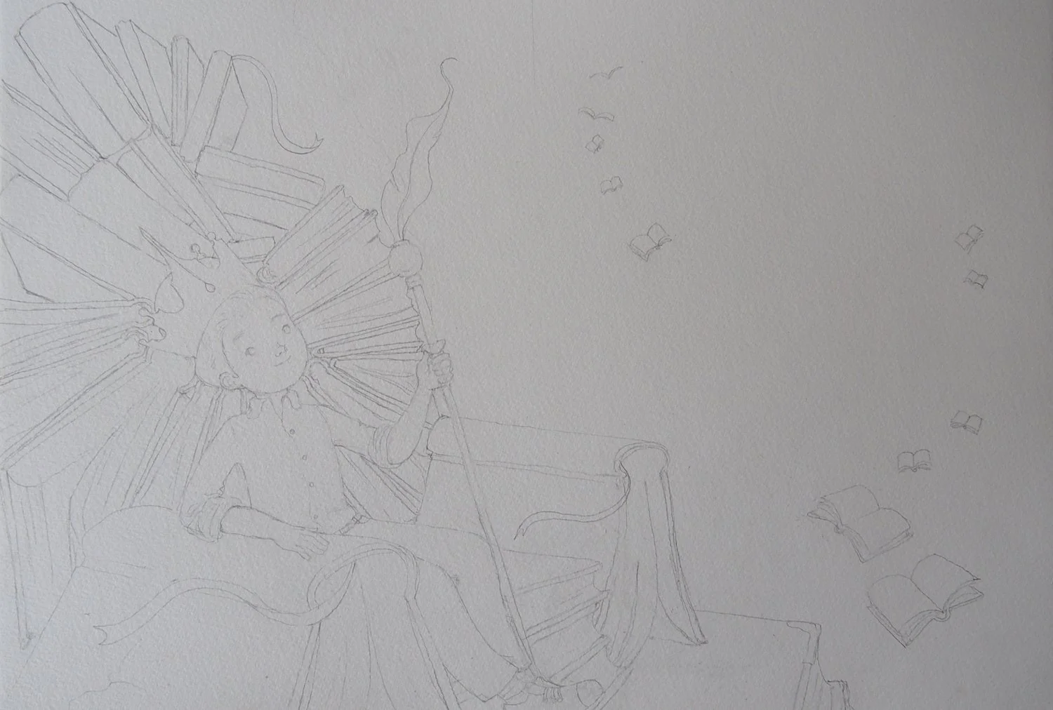
In the illustration process Mateya starts by sketching the scene in pencil, following the digital sketch of the storyboard developed earlier. She draws on A3 size paper to capture the details and augment the quality of the book illustrations.
The sketches are designed in a way to frame the text and allow for the necessary space to add the rhyme. In some scenes, such as the scene with the throne of books, design elements have been added to further elegantly frame the text to enhance it.
Followed by painting the shades first
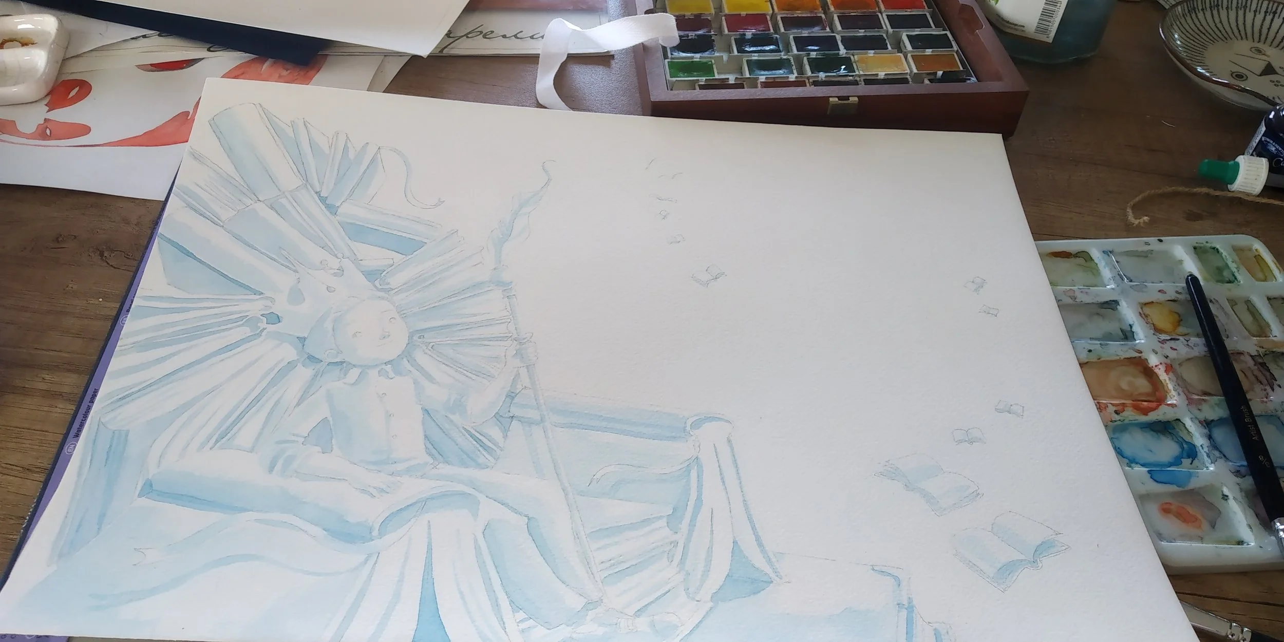
After the sketching process is complete, Mateya then proceeds with shading, “When building an illustration I begin with the shades, usually painted on blue, and continue to draw in pastel colors afterwards.” This process adds depth and space to the painting.

And illustrating in pastel aquarelle
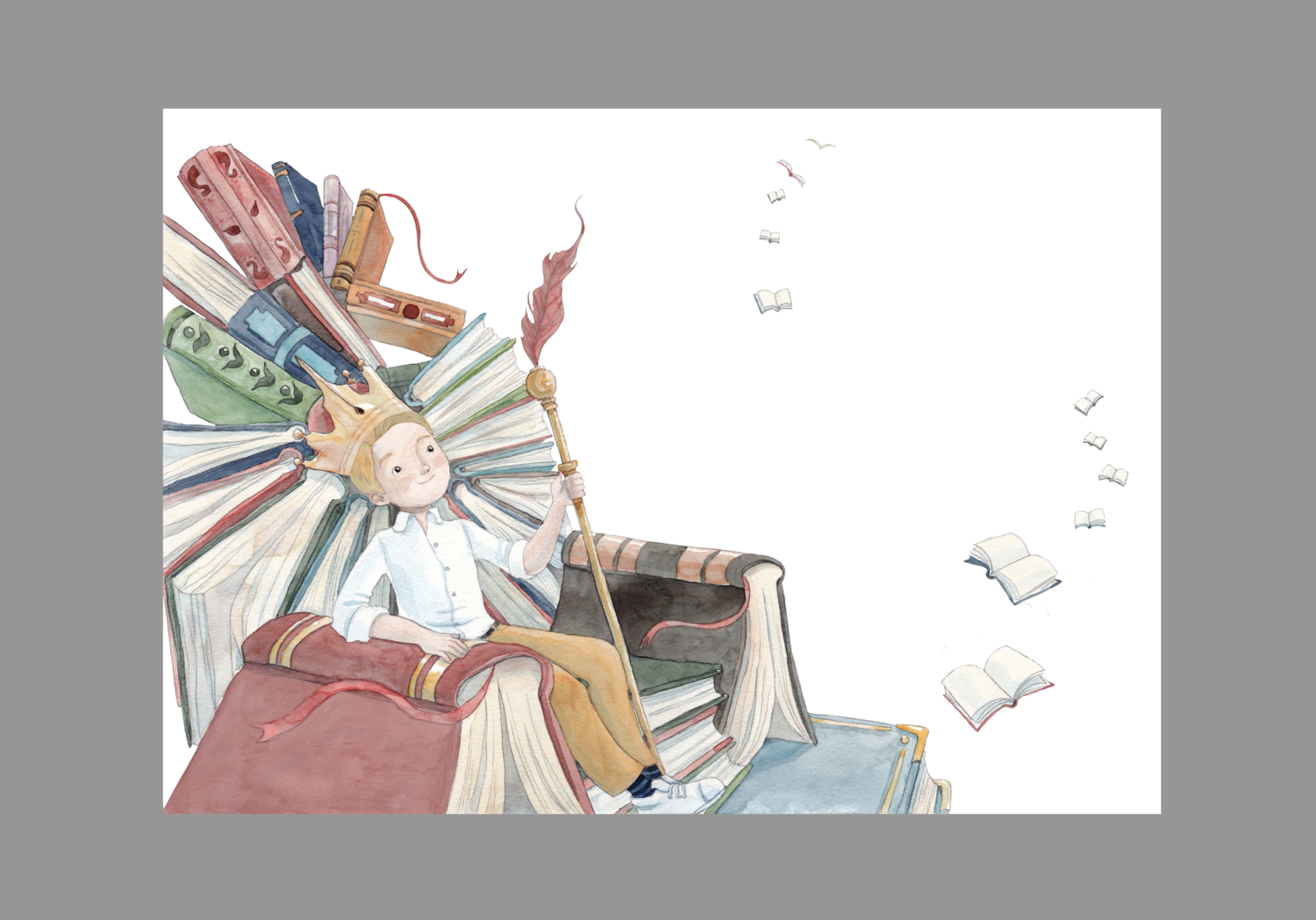
Each element in the illustration is intentionally selected as a contributing piece to the storyline. The lighter color scheme has been composed in pastel to bring vivacity, yet harmony.
Both cold and warm colours have been used In combination, with the warm colors applied to bring out the warmth of the book.
We wanted the colors of the book to not overwhelm when reading the rhyme, but to beautifully compliment it, conveying a comprehensive sense of the story.
Finishing with digital editing
After the paintings are traditionally painted in aquarelle the images are then scanned and digitally processed for color alignment, potential corrections or improvements, and final enhancements.
As an example, in the third scene with the throne we adjusted the main character’s hair as we decided to change it in further illustrations and needed it to align with the previous ones. The colors are also harmonized along the final color palette for consistency, reaching the desirable levels of brightness and contrast.
If you have enjoyed learning more about how we have developed the illustrations for our first book, you might enjoy looking at the art activities we have developed.

